Most of us who have worked on a website project have experienced a conversation like this:
CEO: Can you make the new logo bigger and add the tagline? We paid a lot of money for it, and it does a good job explaining who we are.
Marketing: We need artwork that encapsulates our organization. Stock images don’t do it.
Accounting: We don’t have money for a photo shoot.
Department Head: That first stock image doesn’t reflect our department. Can you make it smaller and add a second image about our team?
Another Department Head: What about our department? We need to have our department represented at the top of the website too.
Human Resources: We need to show off our culture. Can we can get our staff photo and links to all of our job postings at the top?
Sales: We need people to know about our offers. Also, we need a pop-up with a chatbot. Also, can we get something that moves or rotates or changes colors or really stands out in a special way?
Customer Service: Who is going to manage the chatbot?
Before you know it, you have built a website everyone has contributed to, yet no one understands. Fortunately, data (and a strong creative team) can help you out of this pickle. UX designers, including those on MP&F’s Creative Services team, use analytics to figure out how visitors experience your website. With analytics, our team can see:
- How far people scroll down a page
- Whether people click as you intend
- Whether they click across carousels/multimedia sliders (spoiler alert — not often)
- If people are more likely to click buttons if they are one particular color or another
- If people fill out forms
- How long they stay on your site
- If they engage with your pop-ups, ignore them or X out of them
- Many more things like this

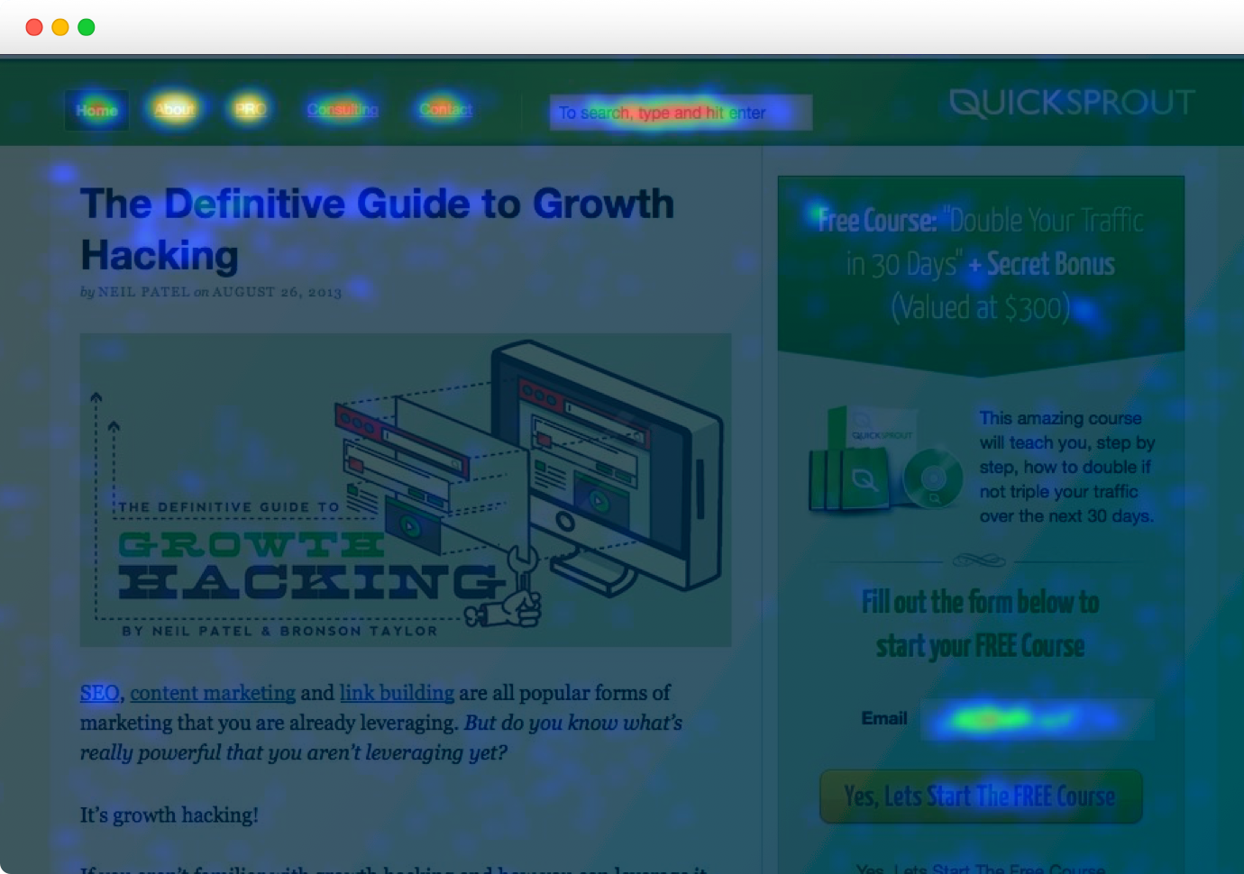
We’ve written about how Google Analytics allows us to gather most of this information, analyze it over time, and compare it with other marketing and advertising metrics. But for UX designers and creative leaders working to get buy-in from multiple stakeholders, sometimes it’s often more helpful to see these analytics visualized in real time. That’s where heat mapping software can be incredibly useful.
One free way to visualize your website’s analytics is with a browser extension that taps into Google Analytics. Chrome has one called — aptly — Analytics, which displays Google Analytics onto whatever page you happen to be viewing (assuming you are logged into Google Analytics for that page’s website).
The limit with Chrome’s extension, however, is that you have to manually compare data from one page to another — or data from one time to another — making it cumbersome to test design changes. Software from companies like Crazy Egg and Hot Jar takes website data visualization several steps further by allowing designers to see multiple pages at a time, take “snapshots” of pages with different types of visualization (heat maps, “confetti” view, etc.) and A/B test designs.
With these tools and a UX mindset, we’ve been able to help clients in a number of industries — from home services to health care, to education — navigate website changes that have brought them more qualified leads and return visitors.
Our team uses Crazy Egg and is happy to help if you need assistance.